Honeyhouse
Rebranding + Print + Packaging Design
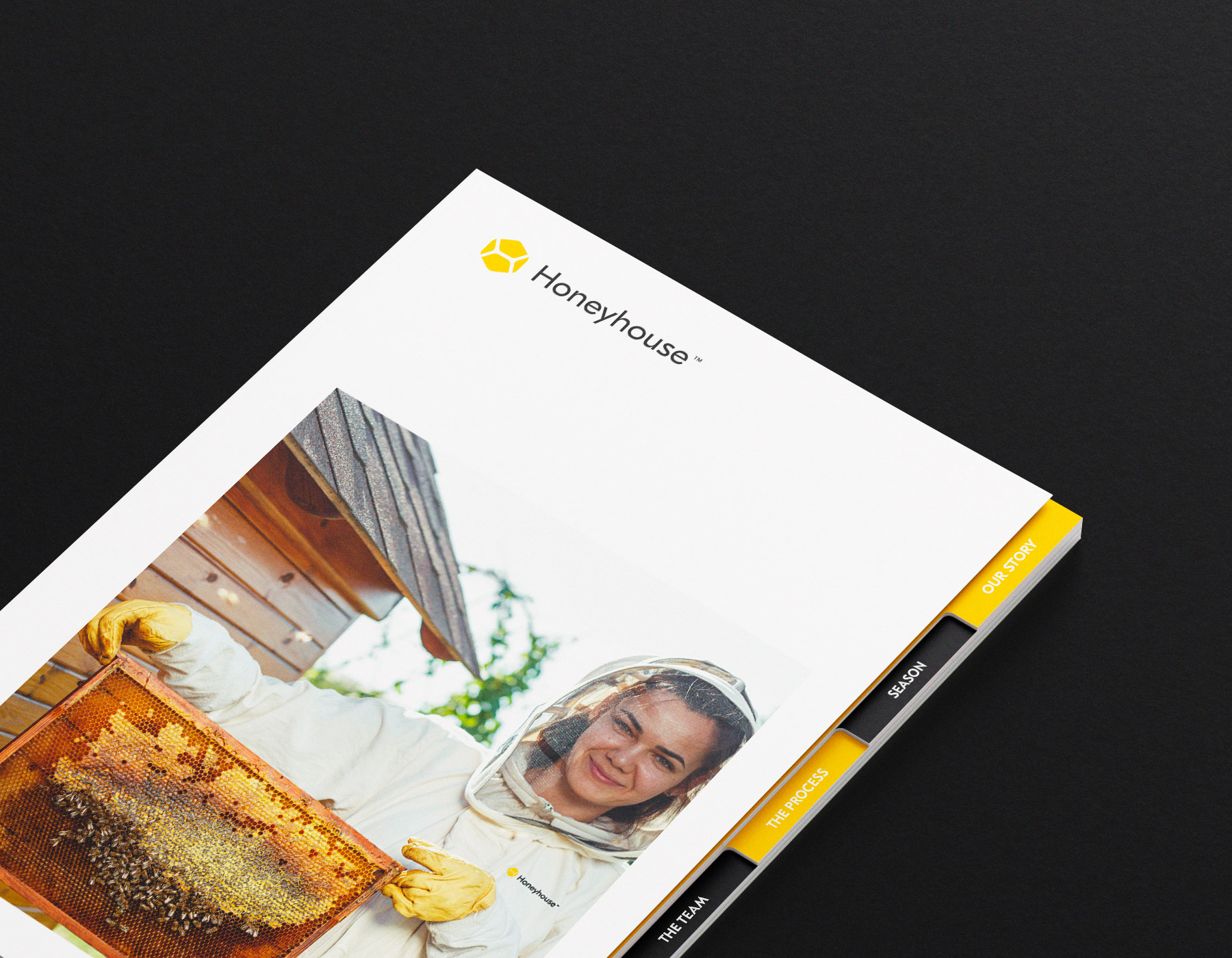
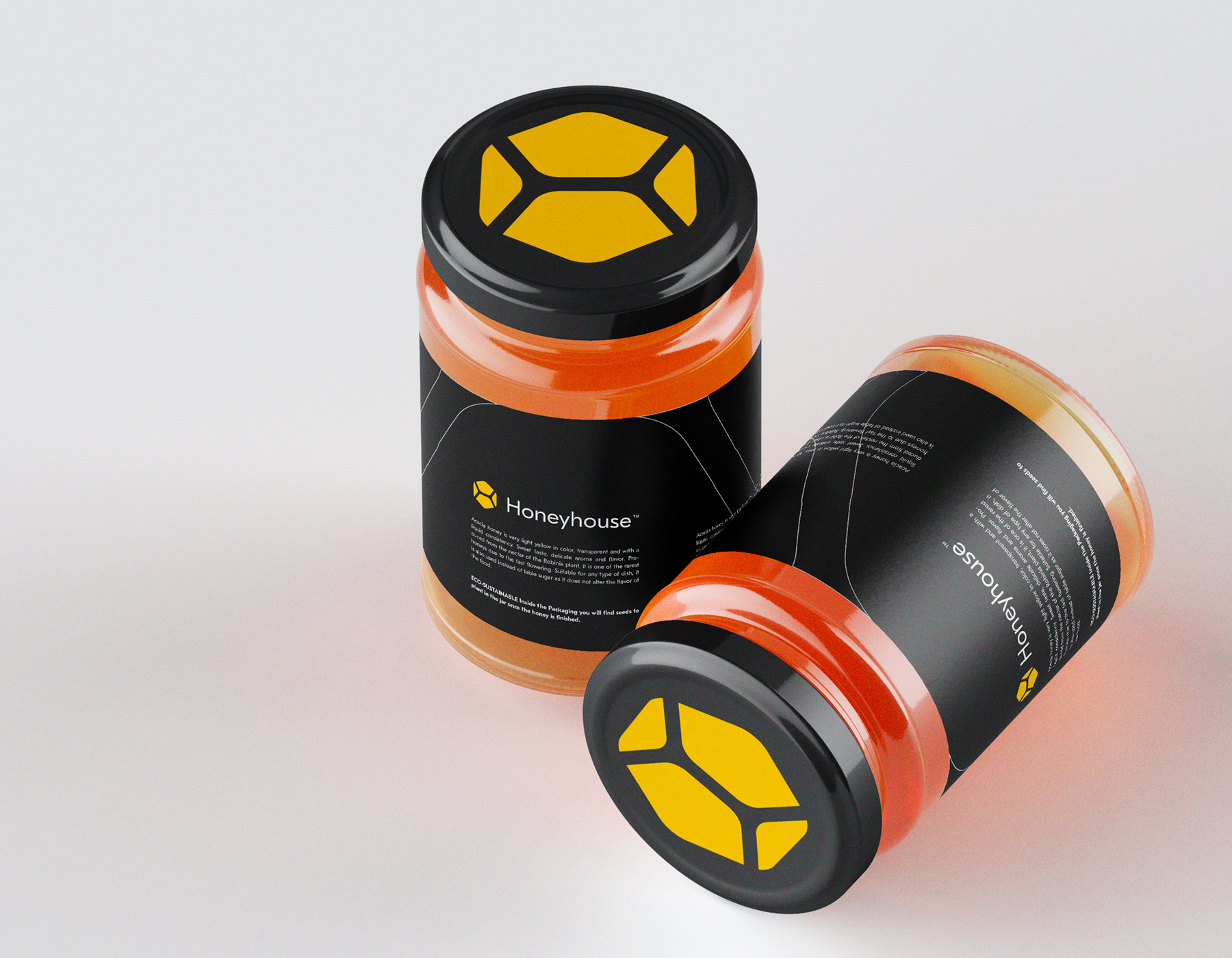
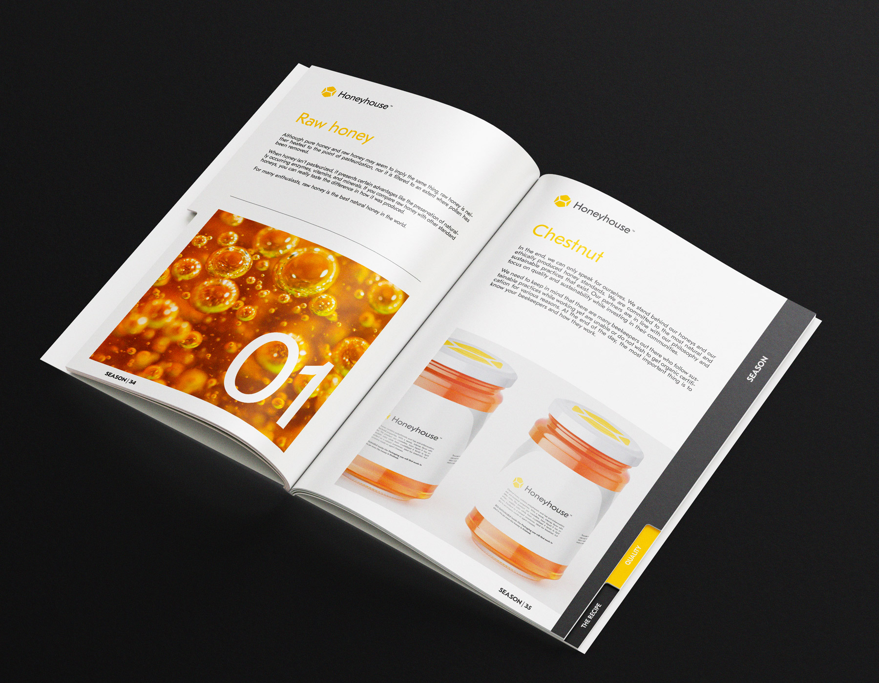
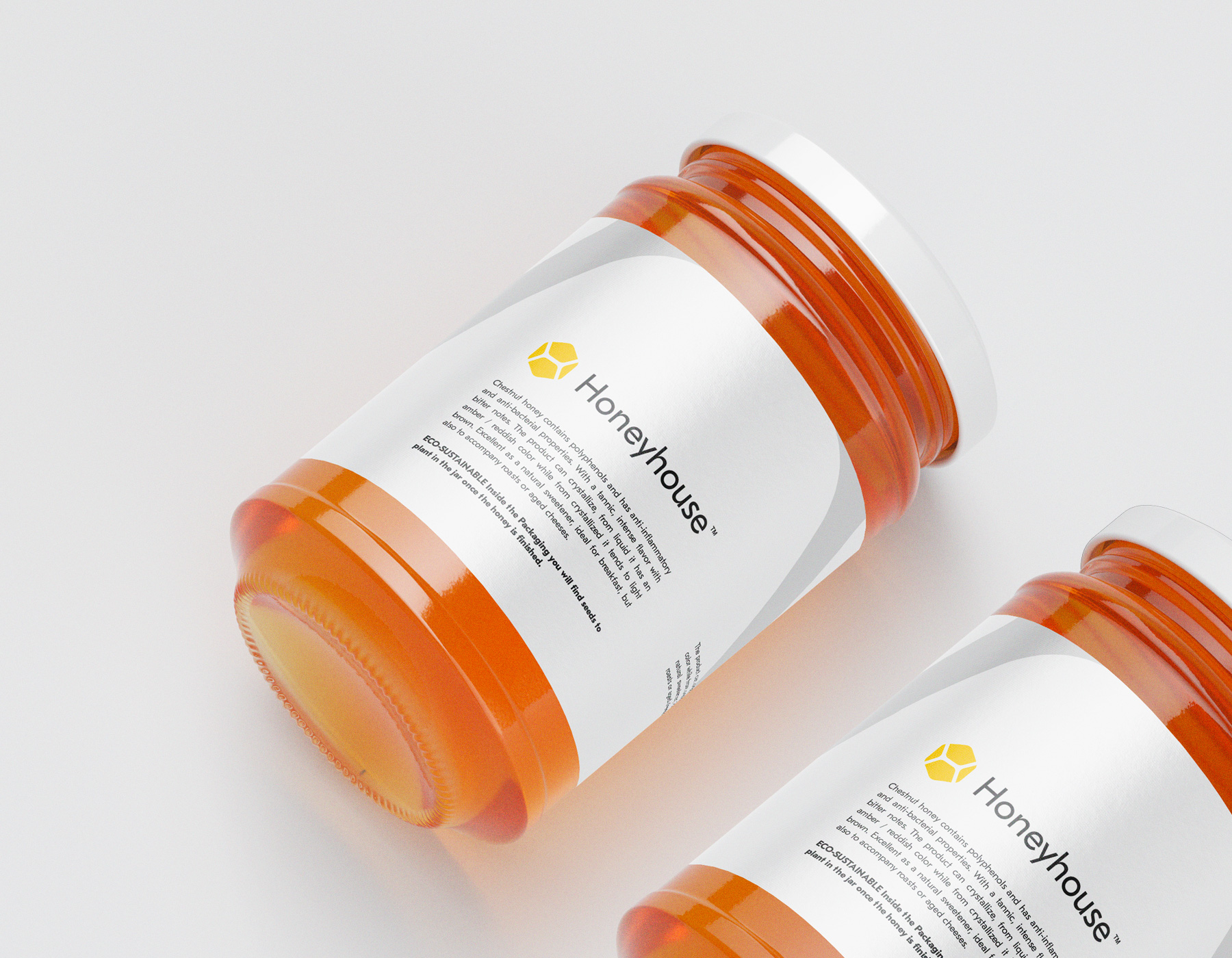
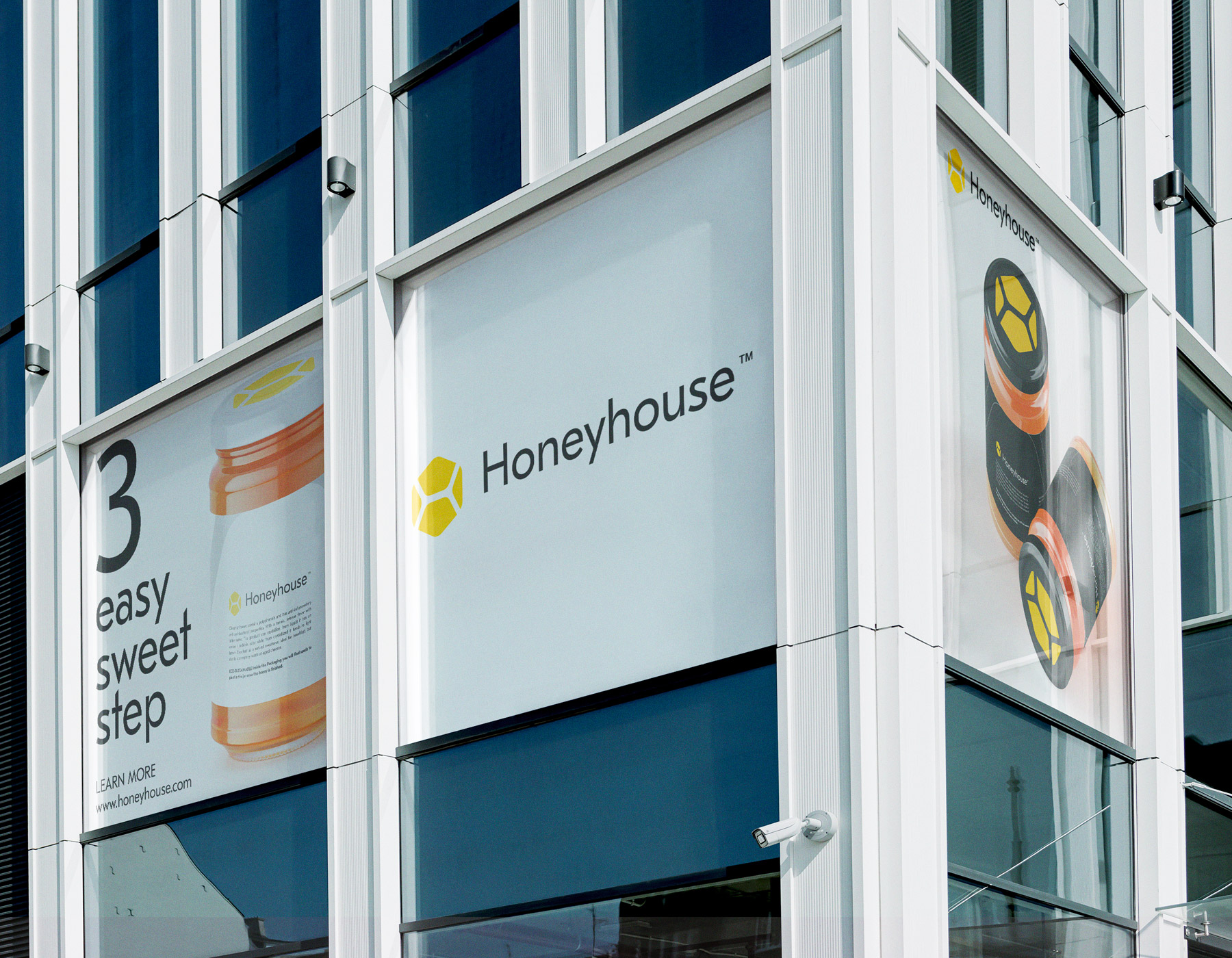
Our strategic rebranding integrates a warm and inviting color palette, reflecting the natural richness of honey. A contemporary logo, inspired by hive patterns, symbolizes both unity and precision. From redesigned packaging to an updated online presence, our cohesive visual identity try to with authenticity, conveying the purity and craftsmanship of the honey-making process. This case study demonstrates the power of rebranding to not only modernize but also elevate the essence of a honey factory, connecting with consumers on a deeper and more flavorful level.